FOR
One Door
Visual Design
DESCRIPTION
For the longest time, One Door lacked a dedicated in-house resource to oversee its digital marketing materials’ look and feel, turning to a great many vendors and contractors to get things done on an as needed basis. As a result, said marketing materials lacked consistency, coordination, uniformity and, while we’re at it, quality adherence to brand standards. There was no singular voice that unified One Door’s collateral and, as a result, its messaging lacked potency and focus.
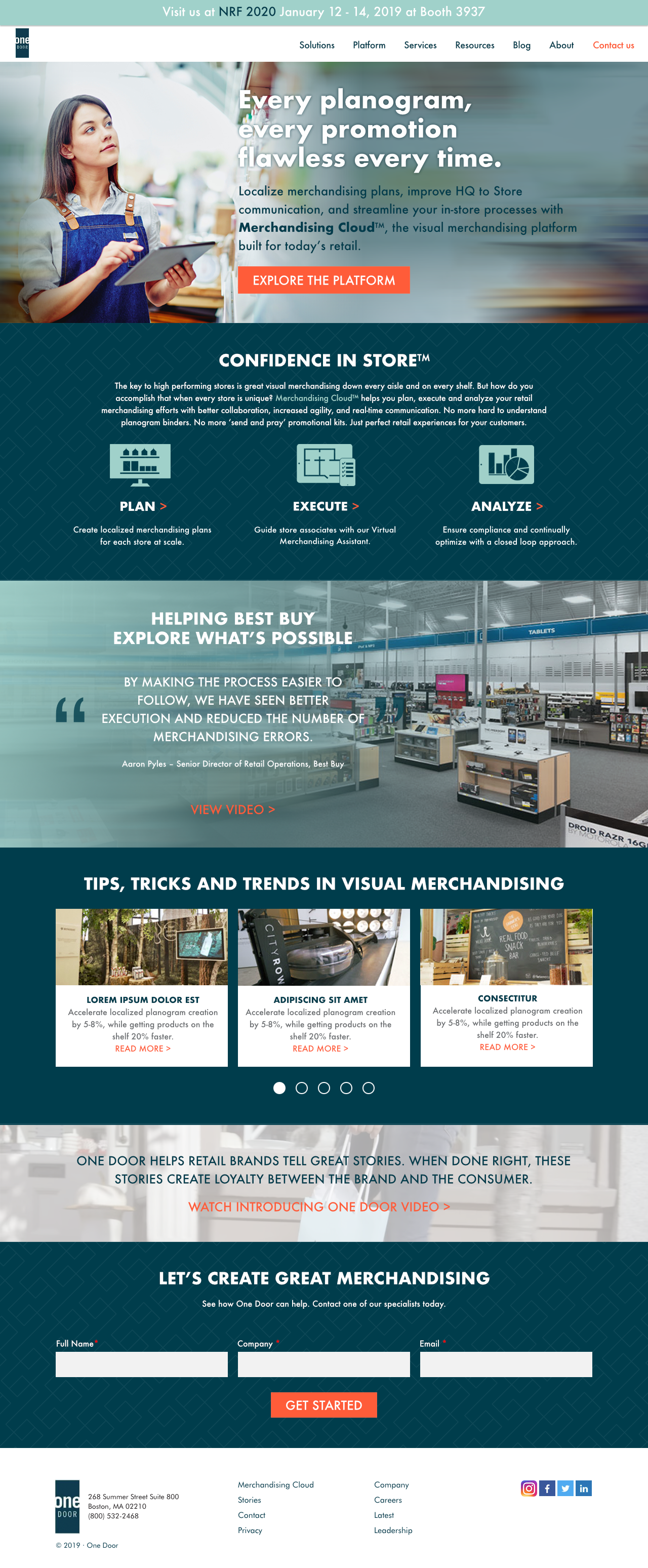
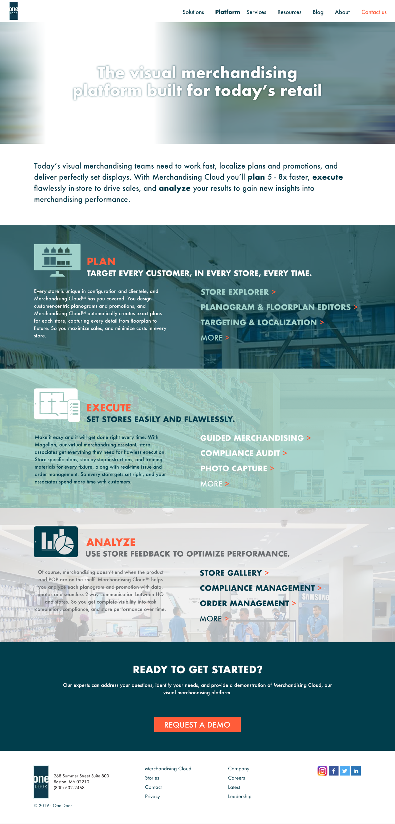
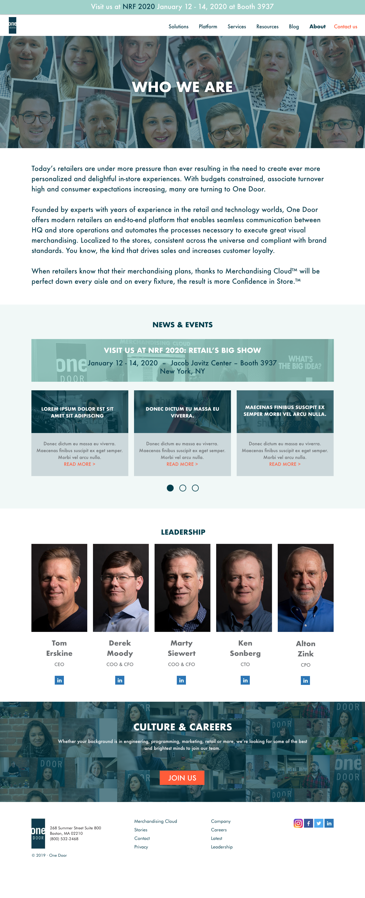
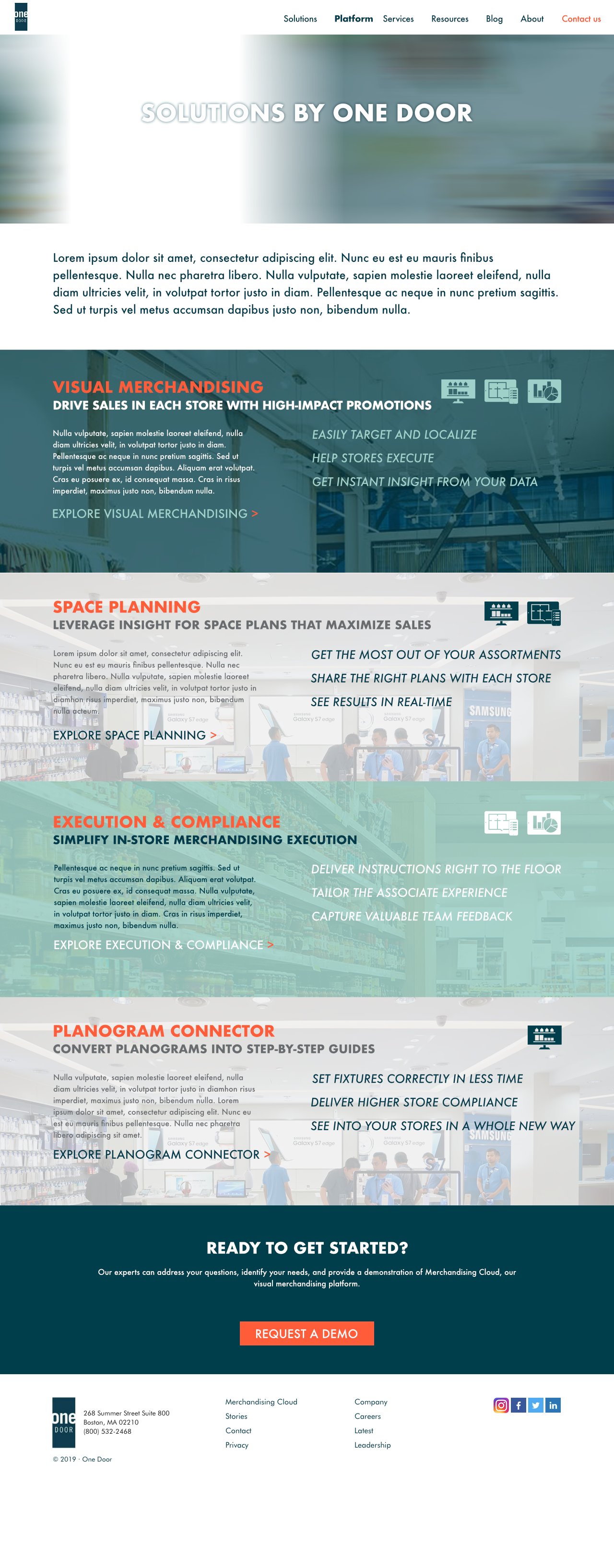
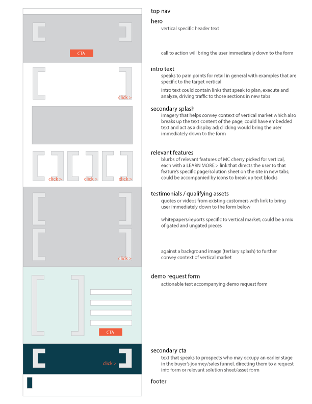
Revamping the website was but one portion of a larger overhaul of One Door’s total digital (and print) marketing collateral. It required expunging orphaned content, extraneous code (that often led to the detriment of the site’s performance and functionality) and so many redundant assets. It was quite frankly a maddening experience to clean it all up to get to the state where it can then be improved. But it needed to be done in order to prevent such a buildup of garbage to continue to accrue. The site was eventually brought to such a state. Moreover, to reinforce a standardized look, content templates were developed in order to better facilitate the creation of more pages. Visual vocabularies were also established, leading to the creation of iconography to be used in subsequent marketing content. Streamlined and, more importantly, in alignment with all other branded materials that came out of One Door, marketing efforts began to be more unified in appearance and tone.
And, really, it just came off so much more professional and polished like this. My God.
