FOR
One Door
Visual Design
DESCRIPTION
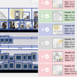
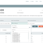
One Door’s enterprise solution, Merchandising Cloud, was a product with a great many moving parts as it touched upon just as many (and then some) internal processes for retail store associates to follow when executing on merchandising instructions as issued by corporate in store locations all over the world. Sadly, the software’s design and development was not privy to the attentions of any dedicated user experience efforts until well after its deployment across several clients. At that point, it had only seen the involvement of various outside agencies for limited scope engagements and the occasional engineer overseeing specific parts of the web application but never the whole web application taken in at once.
When the UX department was (finally) formed, we had our work cut out for us. Any by “us”, I mean the team of two that was comprised of solely a UX Architect (who had little to no actual design training) and me, the company’s first ever UX Designer. (Coincidentally, I was also the company’s first ever in-house Visual Designer of any kind.) There were numerous complaints regarding the difficulty in navigating the application, inconsistencies in the user interface as well as the frustration and confusion felt by users who were at a loss trying to determine how exactly to do their job with the product that their management required they use.
After a thorough UI and UX audit of the web application, it was determined that not only could taskflows be streamlined, cleaned up and made more intuitive, but standardizing the UI as well as its component user interface elements and user workflows would reduce development time and effort by allowing for the re-use of established assets and usability conventions. And also, cleaning up the application just made it so much nicer to use, gave it a more professional polish that sales and marketing could grab screenshots of and improved its overall performance through the elimination of extraneous elements that unnecessarily bogged down the system’s resources.
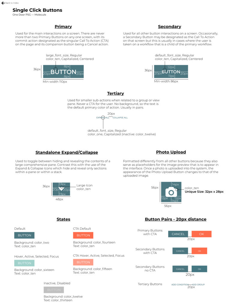
At one point an engineering manager who was part of the audit tallied the number of different ways One Door was making use of button calls-to-action. Not links, mind you. Or even icons. Just buttons. He identified 34 different patterns used throughout Merchandising Cloud. Often, a handful of different kinds of button occupied the same exact page. It was no wonder users were upset.
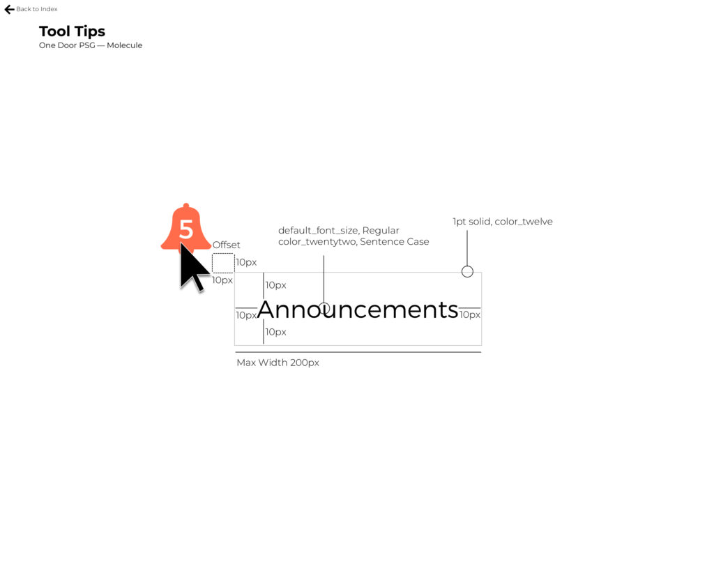
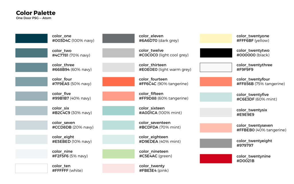
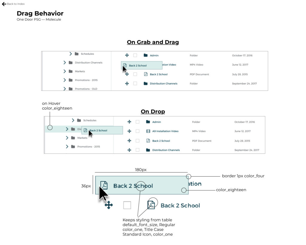
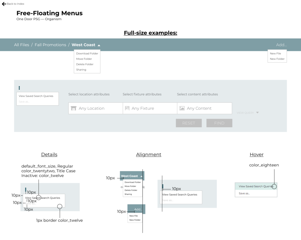
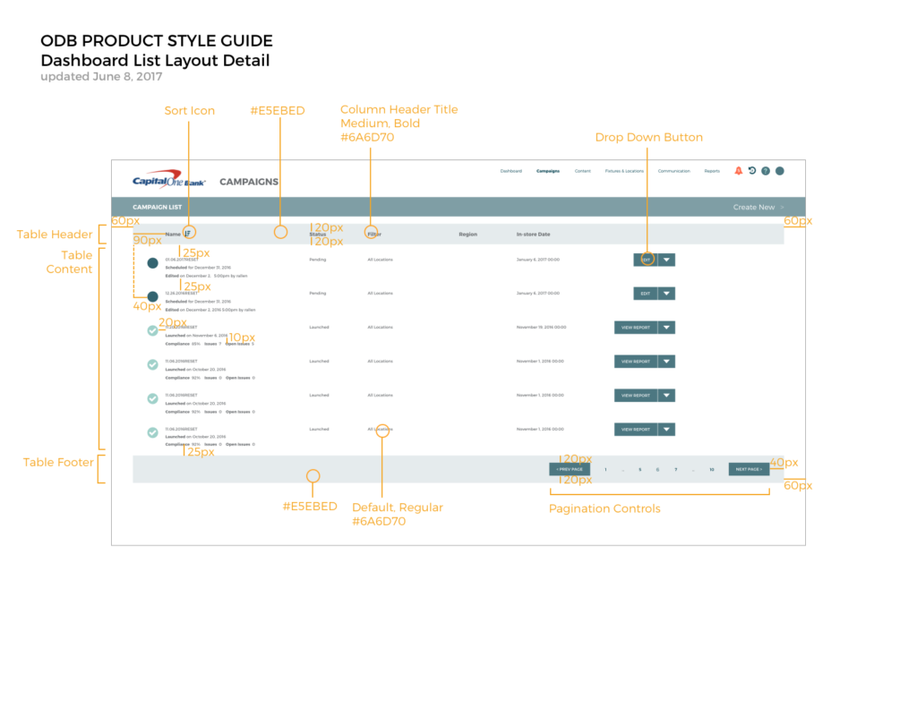
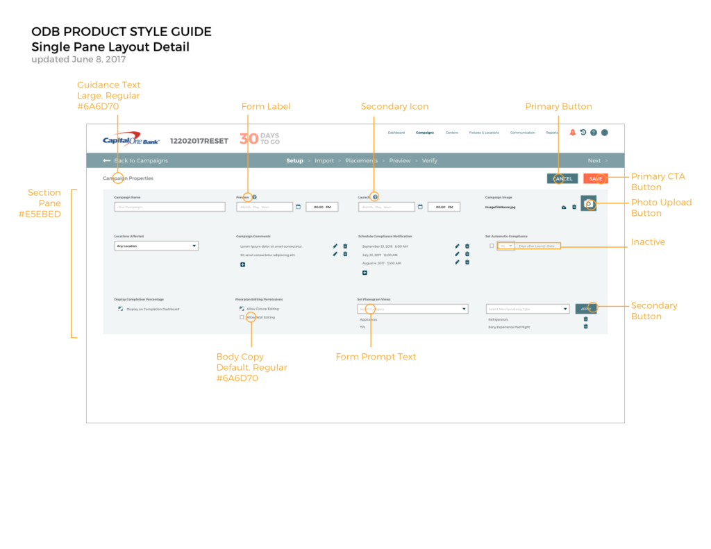
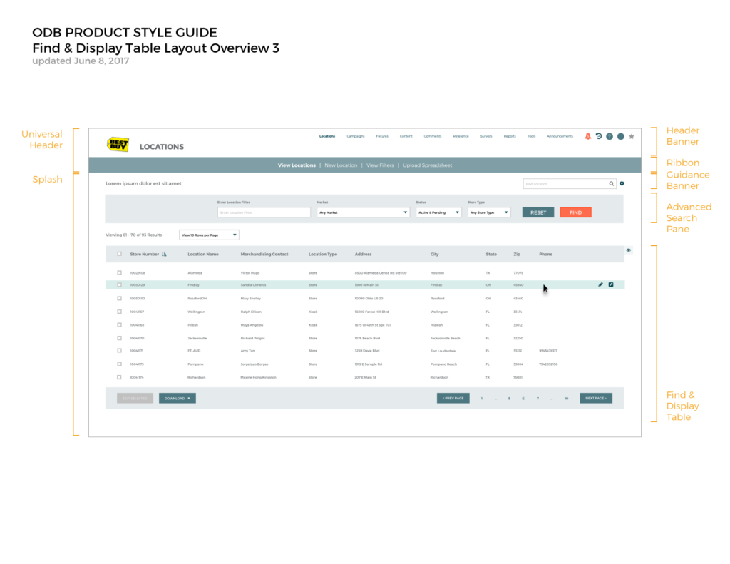
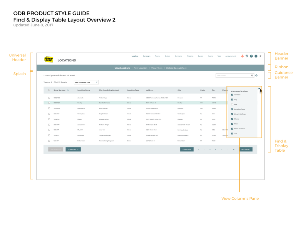
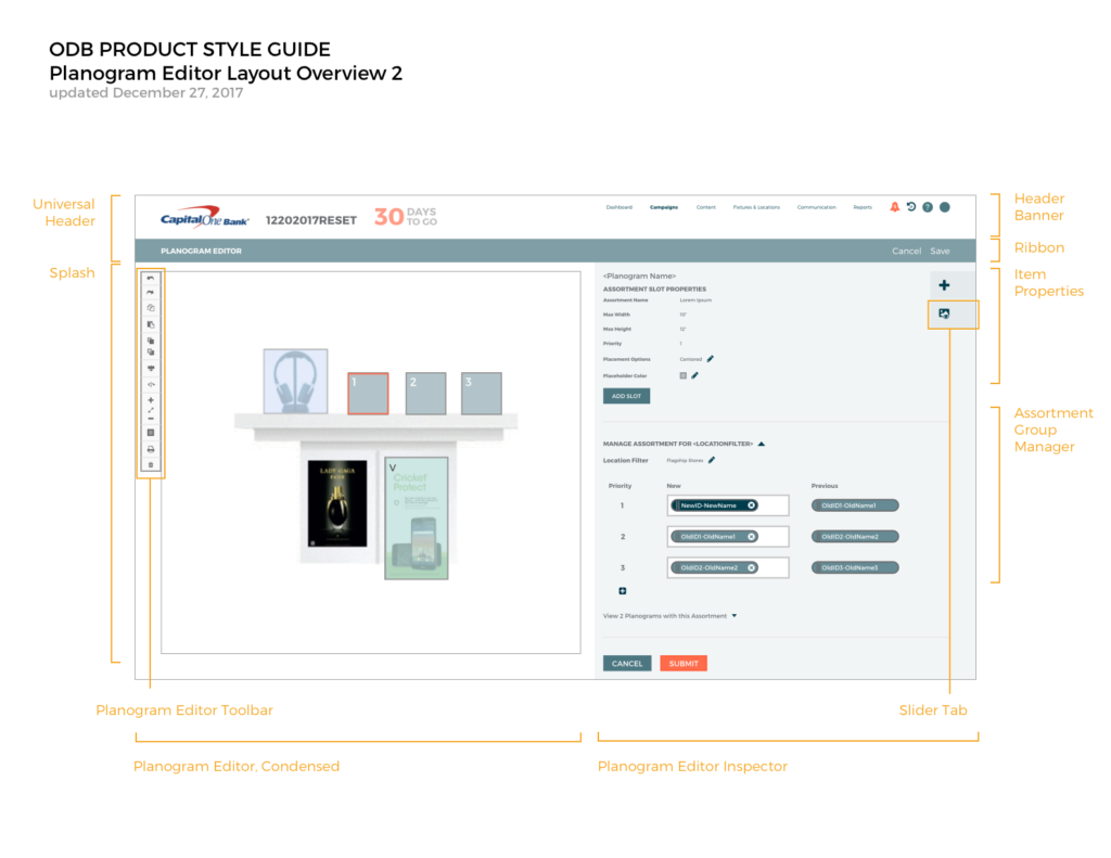
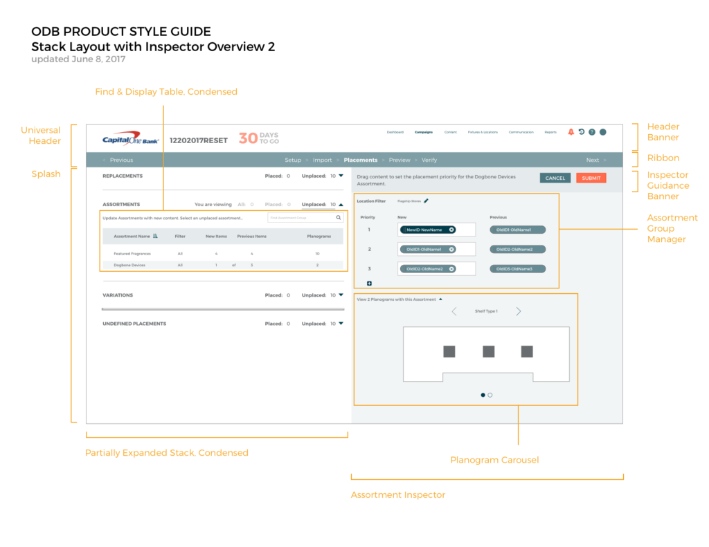
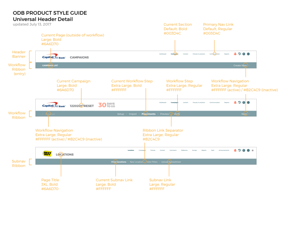
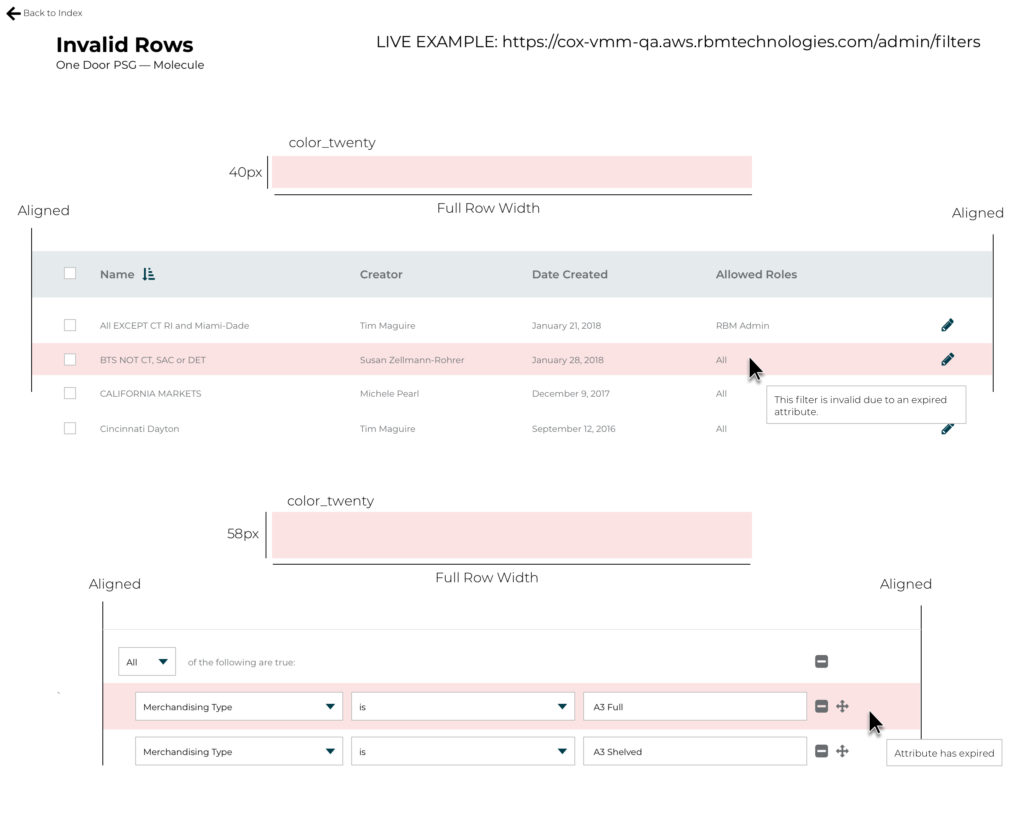
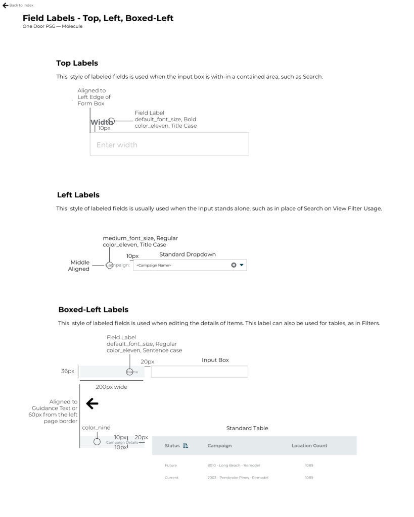
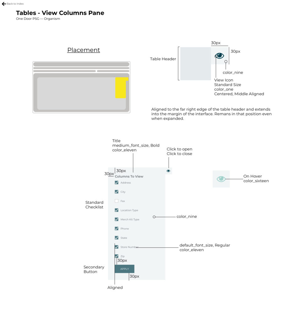
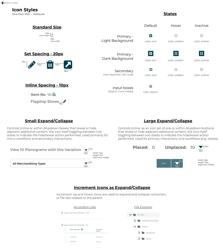
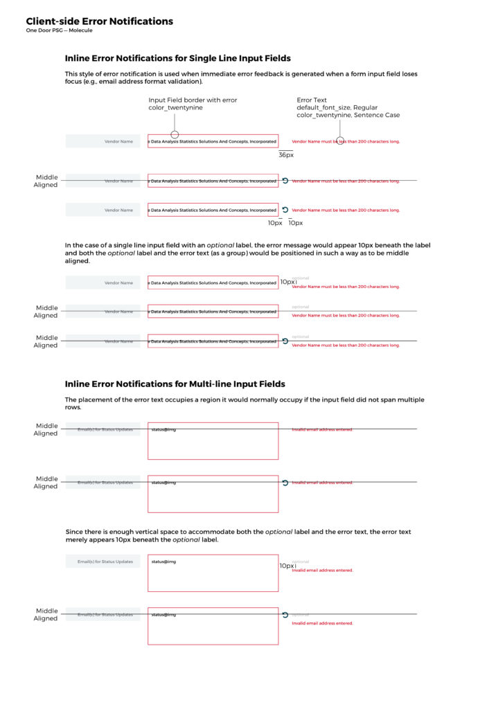
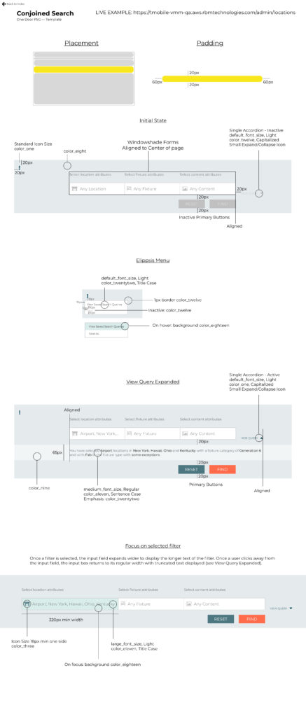
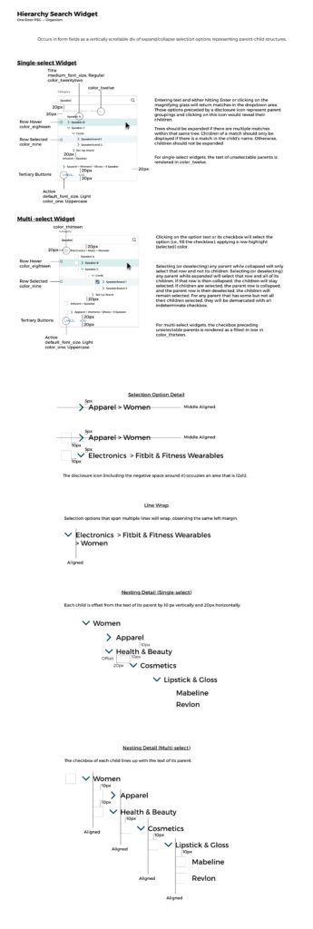
Working with Engineering, Product Management as well as the QA team, One Door’s very first design system was put together, finally providing the company a “single source of truth” as it related to how things were to be built from both a visual and user experience perspective. The resultant style guide (i.e., the design system’s documentation) produced was a work in progress and was always going to be one because, much like One Door’s actual product, the document wound up seeing itself versioned in parallel with the development efforts One Door would make in adding or altering existing product software features. The style guide eventually became something of a living document whose current state would reflect the product’s own current state and later, combined with Engineering’s development of a sandbox environment, led to higher fidelity builds and, consequently, overall product improvements and development efficiency.
The Sketch app was used to create and continually append to and amend the document. Zeplin, a Sketch plugin, made it possible to easily share and annotate the documentation with the development team.
